Various Project's Graph, Plot, Dashboard
Vision Transformer for Cardiomyocyte Ageing Detection
z = (1/T) ∑t=1T zt
Investigation on Deep Learning Methods for Heart Image Analysis: Progress, Implications, and Prospects for the Future
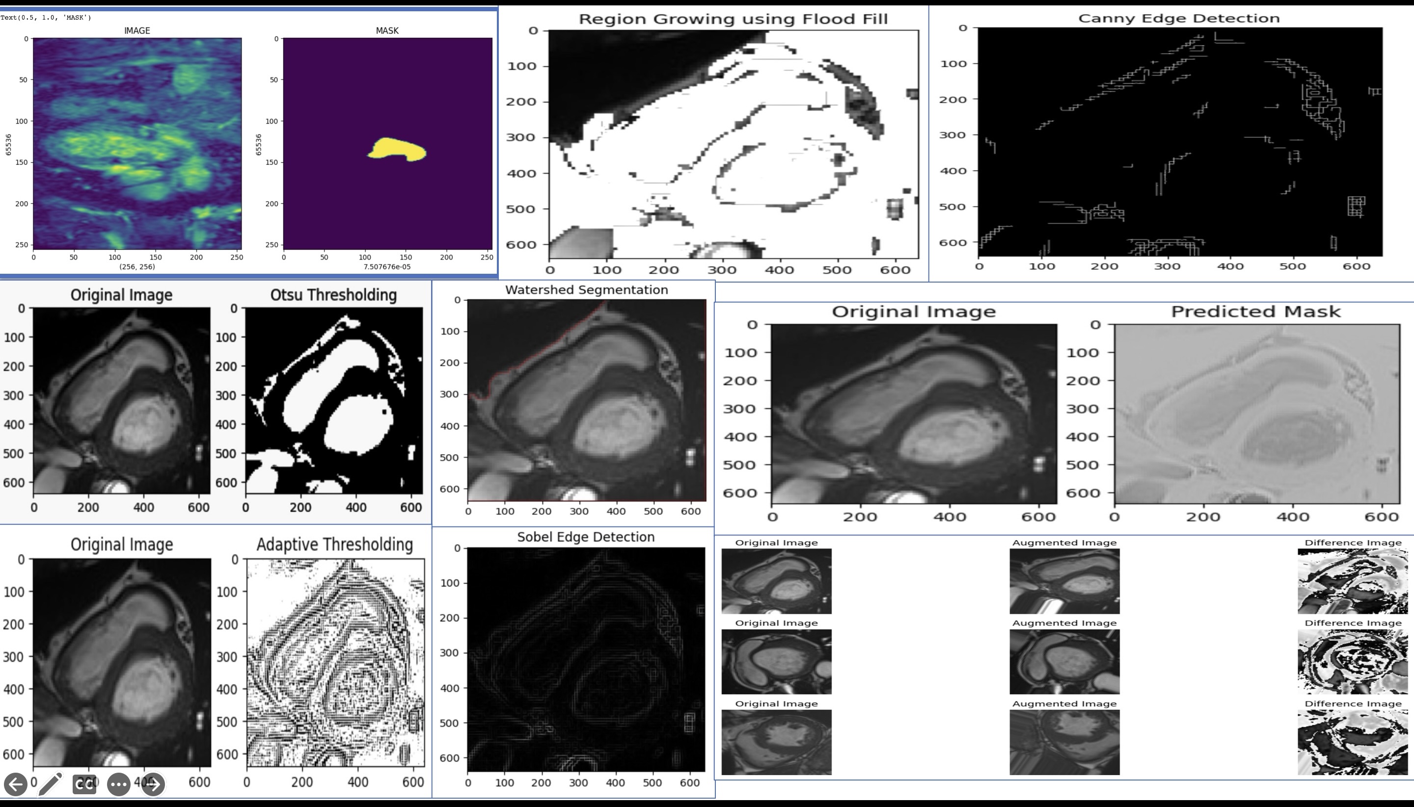
In our project, we prioritized advanced data preprocessing for the Hybrid Deep Learning Solution for Cardiac Image Analysis. We employed data augmentation techniques like rotations, translations, shear, zoom, and horizontal flips exclusively on our training data to ensure model robustness. To avoid data leakage, normalization parameters derived from the training data were applied to the validation and test data. Additionally, we computed pixel differences for enhanced image clarity. We also incorporated various deep learning and traditional image processing methods, such as U-Net for biomedical image segmentation, Canny Edge Detection, Sobel Operator for edge identification, and region-based techniques like Region Growing and Adaptive Thresholding. Otsu's method helped us determine optimal thresholds for image segmentation.
Machine Learning and Sustainability Metrics: Optimising Risk Assessment and Default Prediction
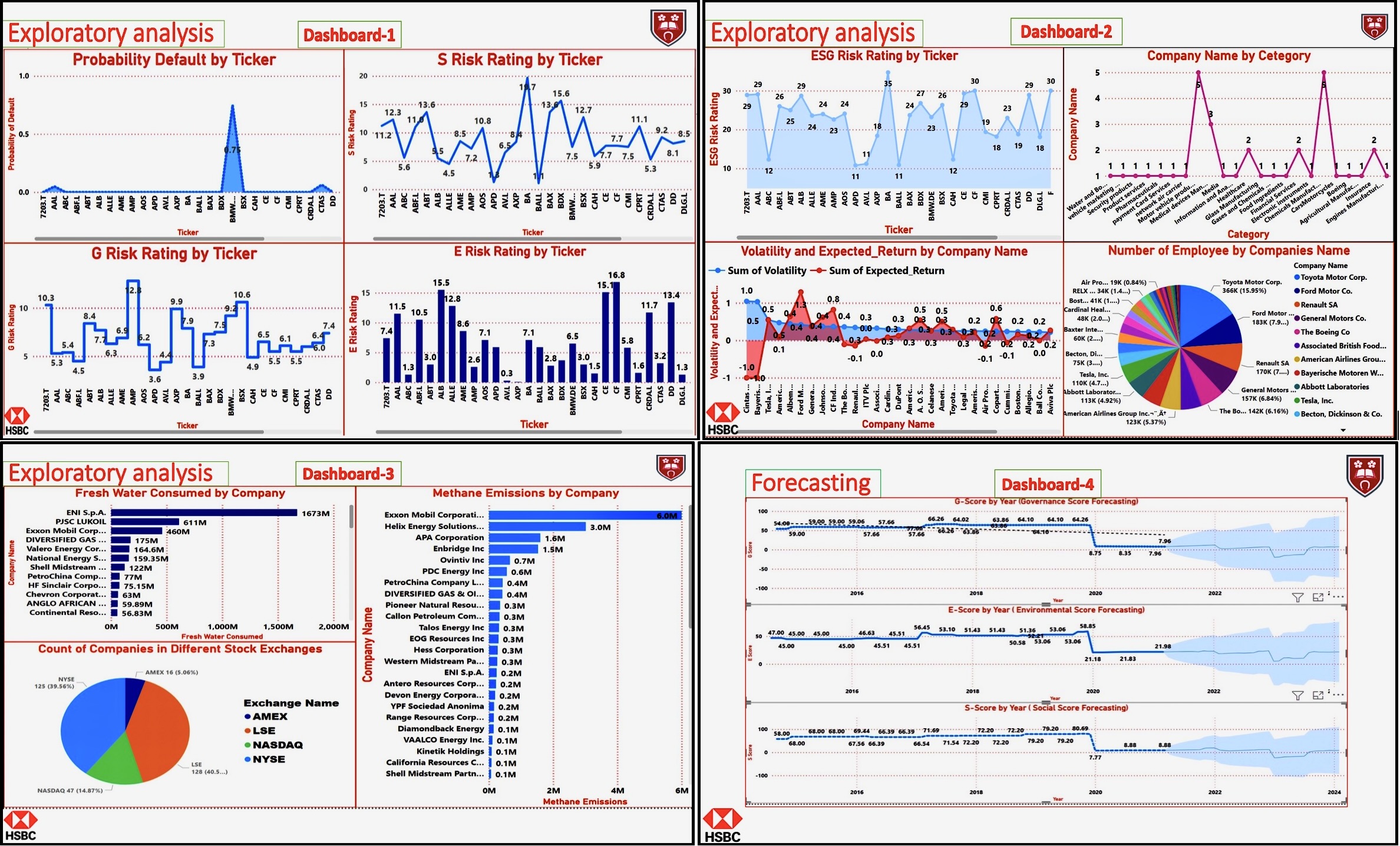
Above dashboard is the ESG performance analysis. Dashboard-2 among four reveals a notable correlation between volatility and expected returns per company. The expected return denotes the anticipated profit or loss from an investment, based on historical performance. This can guide investors about potential profits or losses. An increase in volatility often aligns with negative returns, demonstrating a relationship between these variables. Volatility risk is quantified through statistical measures. Hence, the graph depicts an inverse relationship, indicating higher volatility correlates with lower expected returns. Other parts of the dashboard highlight respectively how the integration of sustainability metrics can profoundly affect company default probability predictions, surpassing conventional methods. Utilizing these insights, financial institutions can more accurately assess credit risk and make better-informed lending decisions.
Breast Cancer Detection by Advanced Machine Learning
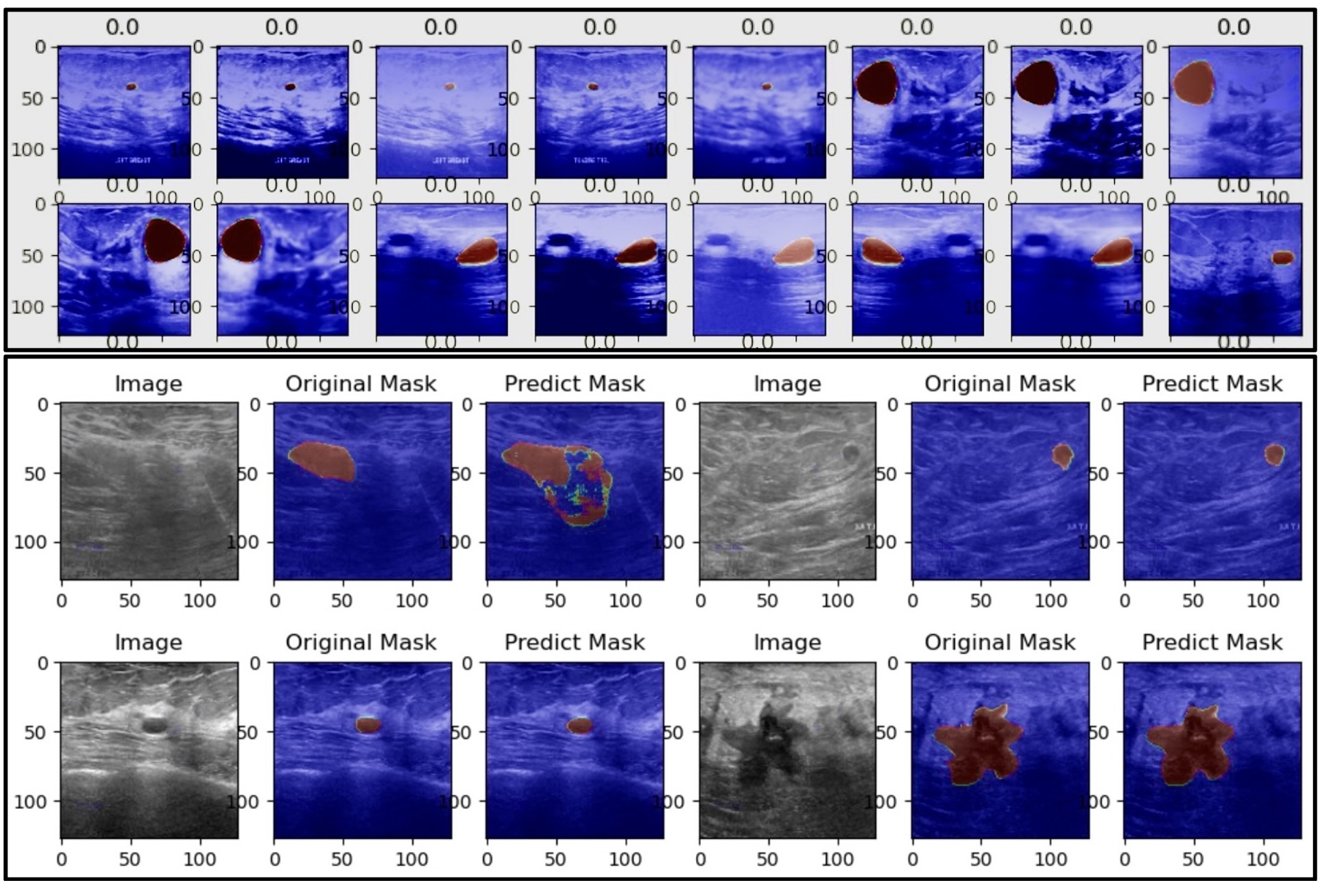
Above the visualisation of breast cancer image detection and segmentation
Enhanced Risk Assessment: ECG Signal with Arrhythmia Risk Probability
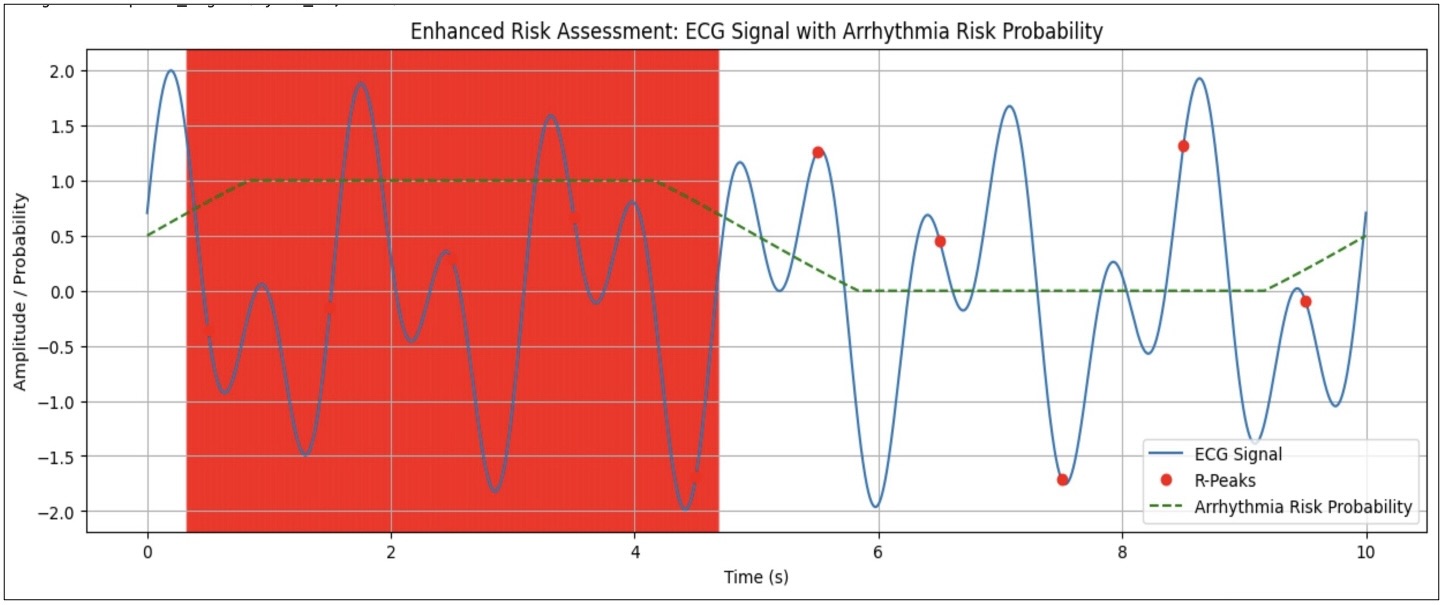
Integrates ECG signal data with arrhythmia risk probabilities. The blue line illustrates the ECG signal, depicting the heart's electrical activity over time. The green dashed line represents the arrhythmia risk probability, which increases progressively throughout the time series. Red dots mark the R-peaks, essential points in the ECG signal. The red shaded area likely highlights a period of increased risk, indicating a critical or elevated likelihood of arrhythmia during this interval.
Key phrases that describe this image might include:- Integrated ECG and Arrhythmia Risk Assessment
- Highlighting High-Risk Periods in ECG Signals
- Enhanced Diagnostic Visualization for Arrhythmia Detection
Bitcoin Price Forecasting Dashboard
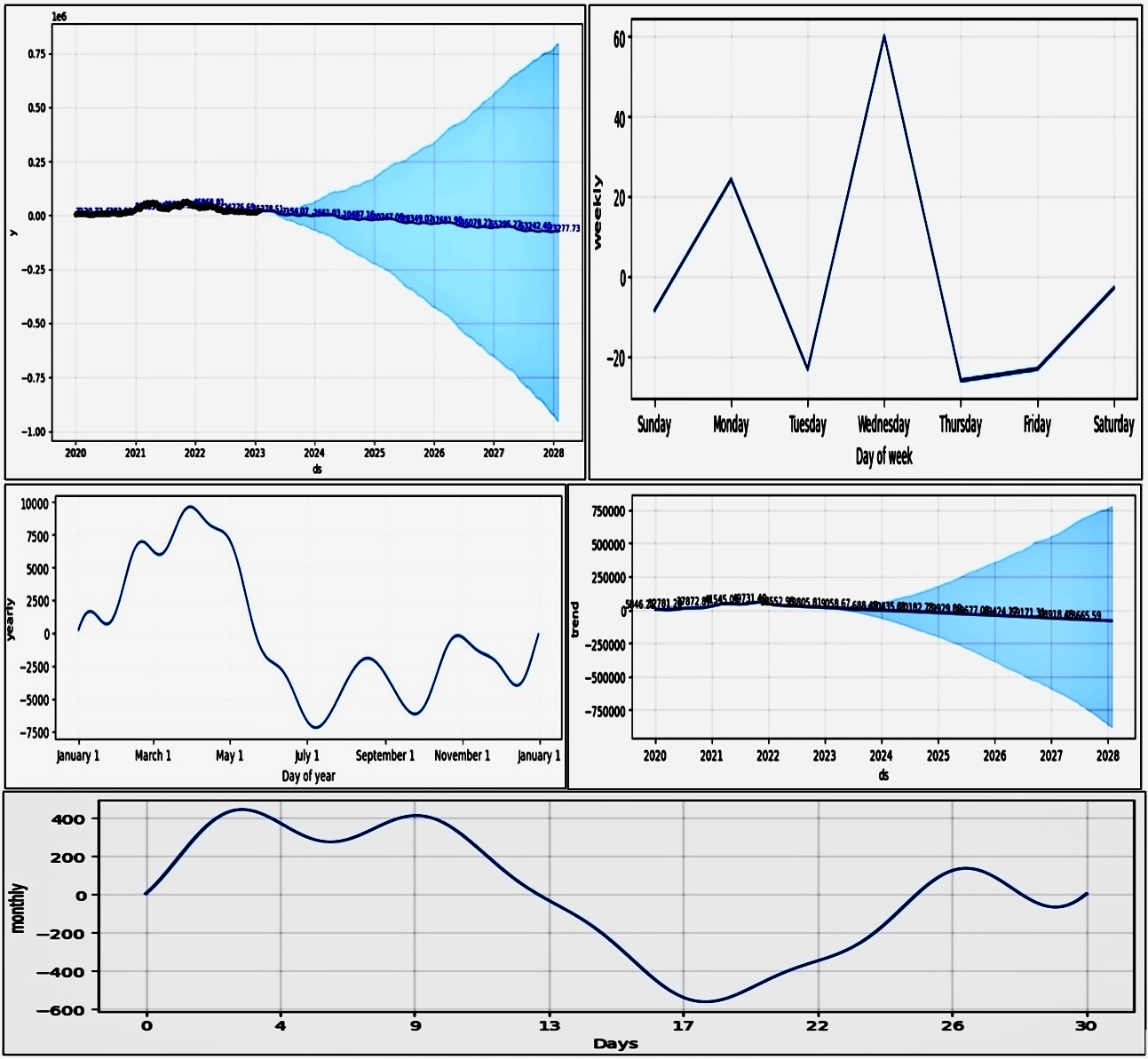
For cryptocurrency, we have chosen Bitcoin as the currency. We used the Prophet algorithm for the forecasting model in the computing section. As mentioned in the Introduction, our major objective is to investigate the impact of using Twitter data for predictions in diverse domains, either in conjunction with or independently of different machine learning models that are widely used in the Deep Learning field. As a result, following the previously described tweet processing, we are left with two distinct series: the Twitter series (price or date) and the target price series, which we are trying to anticipate. The forecast results from the Prophet model show a time series of Bitcoin market price predictions. The forecast includes daily predictions ('ds'), 'ds' mean date with an associated predicted value ('yhat'), and 'yhat' mean price in the Y-axis as a dependent variable, along with lower ('yhat lower') and upper ('yhat upper') bounds for these predictions. The results indicate a declining trend in Bitcoin prices over the forecast period in Figure 16 Bitcoin Price Forecasting Dashboard extending up to the year 2028. From the values provided, we see predictions starting from January 1, 2020, with an initial forecasted price ('yhat') of approximately $7120.72, and by the end of the forecast period on January 29, 2028, the predicted price drops to around -$74035.19. These negative values for the 'yhat' in the latter years are not feasible for actual Bitcoin prices and may indicate an anomaly in the data, an overfitting issue, or limitations within the model when extrapolating far into the future. The result provides a predictive baseline for the Bitcoin market price based on historical data. This baseline can be critical for the project as it establishes the expected market behavior without external sentiment influence, which could be compared against models that do include sentiment data for a more comprehensive analysis. The project aims to explore the influence of Twitter sentiment on Bitcoin prices. While these results do not directly measure that influence, they offer a starting point for understanding market trends that sentiment analysis could build upon. To align the forecast results with the project's aim, future research would need to include sentiment data as a variable in the prediction model to measure its impact against the baseline established by these results. The forecasted data from the Prophet model provides a quantitative foundation for future research that aims to integrate additional variables, such as public sentiment from Twitter, to enhance the accuracy and relevance of Bitcoin market predictions. Models taken into consideration in the experiments have been selected based on the fact that this is a binary classification problem
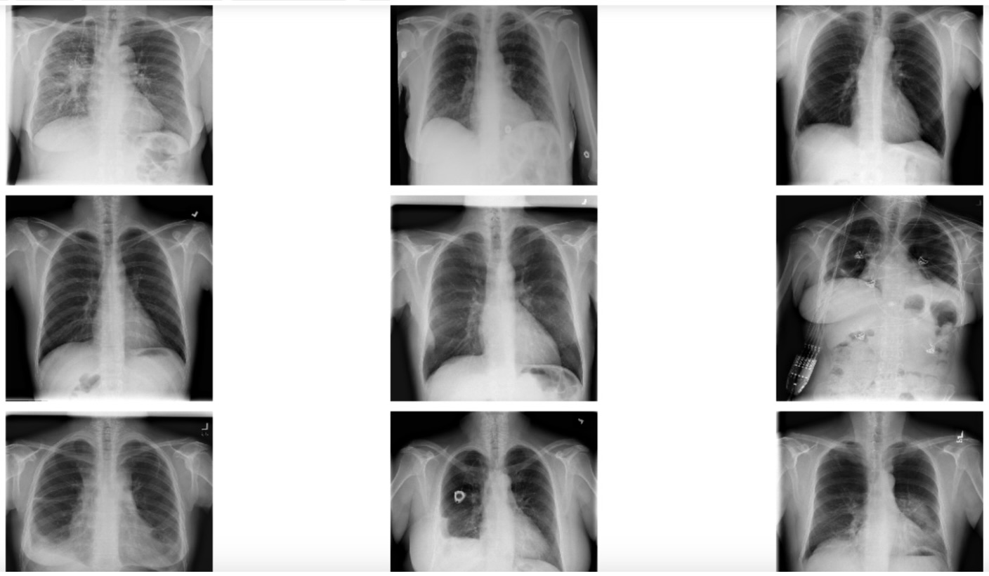
Data Augmentation on Chest X-ray Image Data
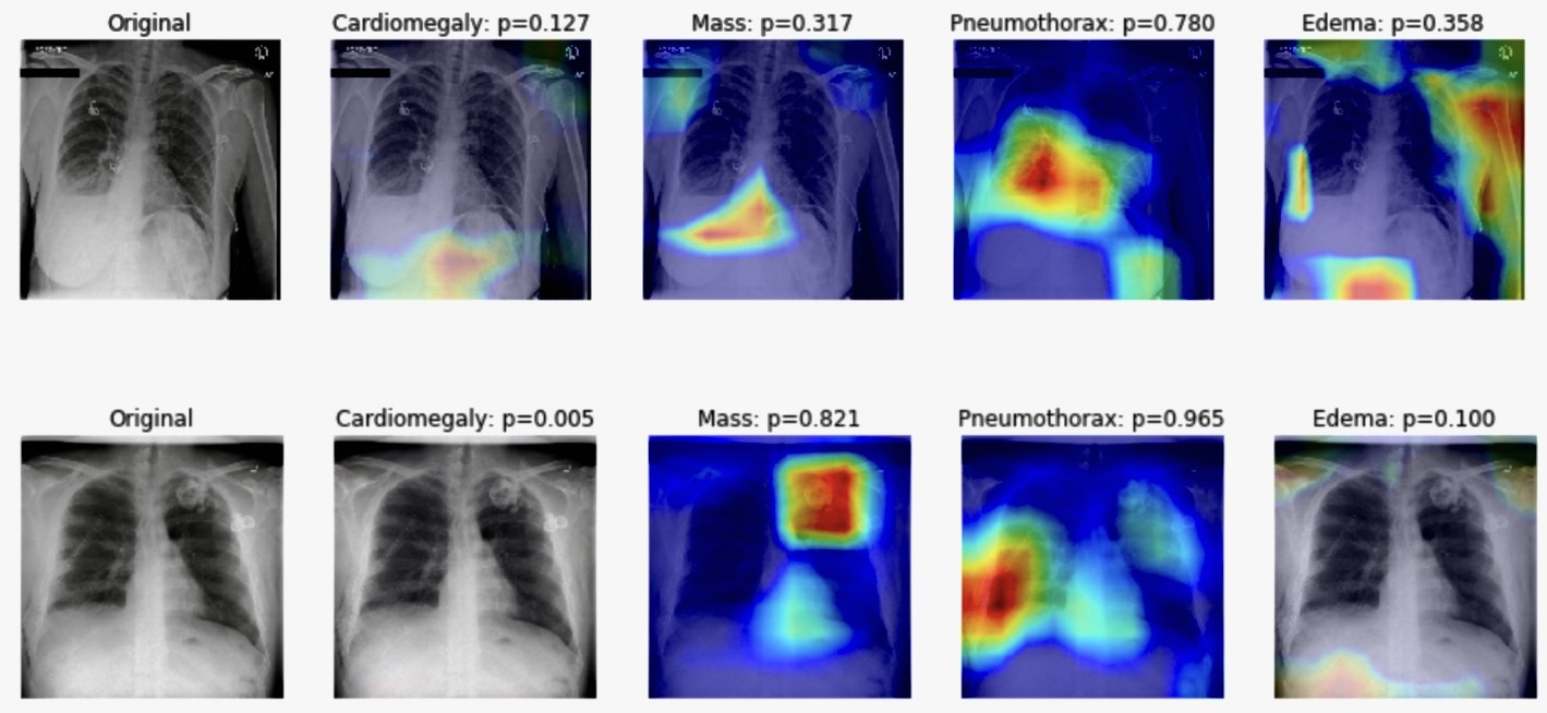
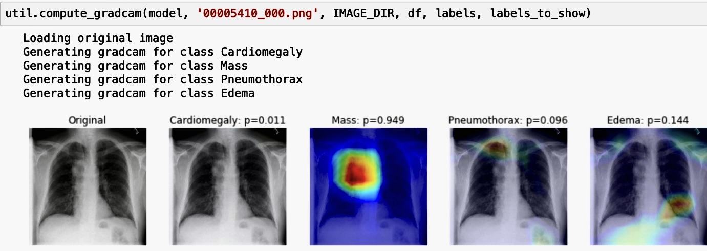
The dimensions of the image are 320 pixels width and 320 pixels height. The maximum pixel value is 1.7999 and the minimum is -1.7404. The mean value of the pixels is 0.0000 and the standard deviation is 1.0000
Schematic Representation of a Neural Network Architecture
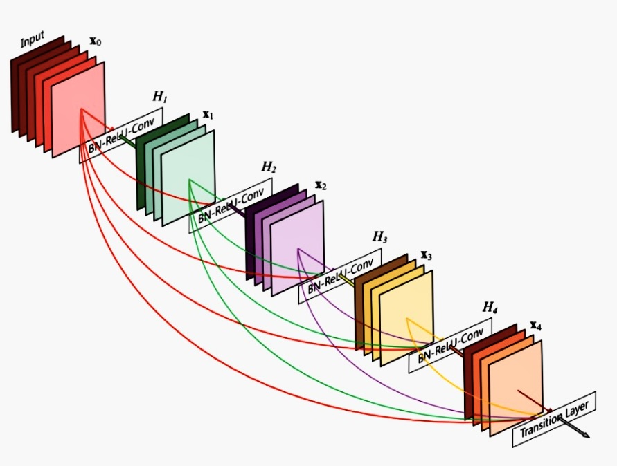
The architecture seems to show the flow of data through multiple layers, each performing a set of operations such as batch normalization (BN), activation (ReLU), and convolution (Conv). The layers are represented by multicolored blocks, with lines indicating the flow of data from one block to the next. The terms "H1," "H2," "H3," etc., are likely referring to different layers or stages in the neural network, and "X0," "X1," "X2," etc., could be representing the input data or features being transformed as they pass through the network. The "Transition Layer" at the end suggests a point in the network where the data is further condensed or transformed before passing to the next stage, which could be for purposes like dimensionality reduction or feature pooling.
ESG Trend Analysis by Interactive Dashboard
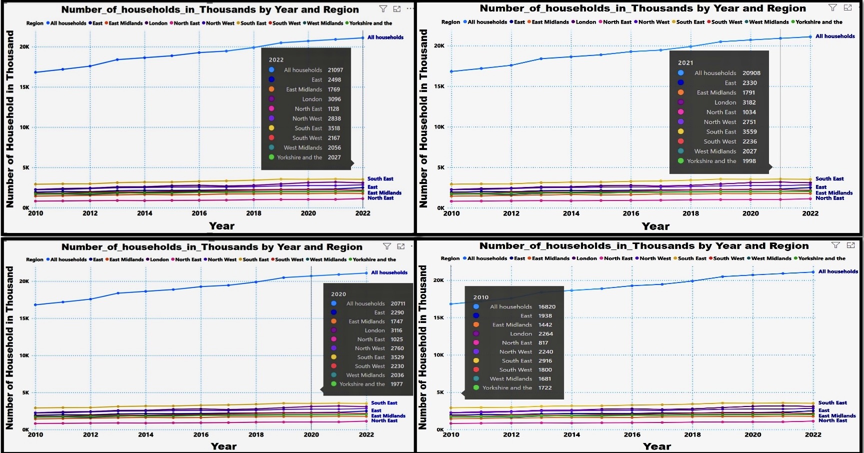
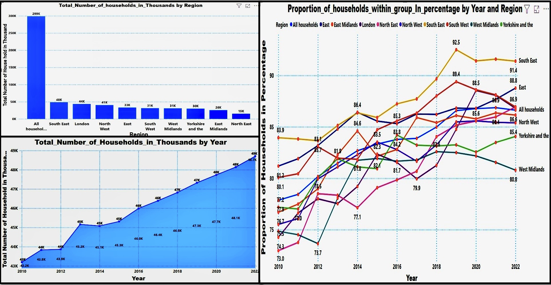
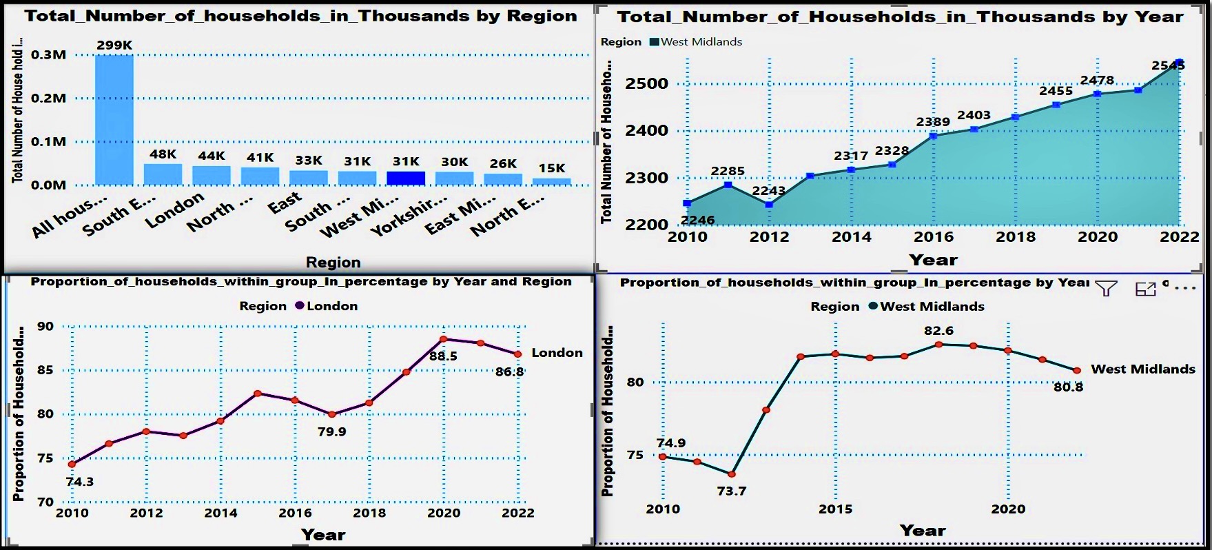
The series of graphs present a comprehensive view of household distribution and trends over time across various regions. The bar graphs offer a snapshot of household numbers in thousands, highlighting disparities among regions, with a clear dominance of "All households" as a collective category. The line graphs provide a dynamic perspective, revealing the proportion of households within each region as a percentage of the total, indicating not only growth in absolute numbers but also the changing weight of each region over the years. Particularly, regions like London and the West Midlands show significant fluctuation in their proportions, suggesting varying economic or social factors influencing household growth and distribution patterns. Collectively, these visual data representations allow for a nuanced understanding of regional demographics and can inform policy-making or resource allocation within these areas.
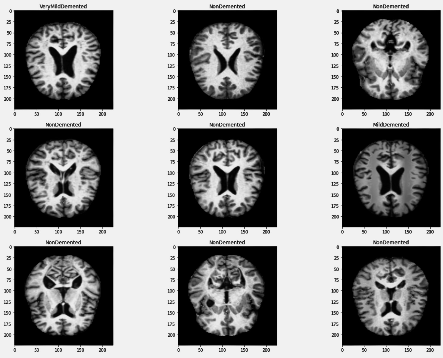
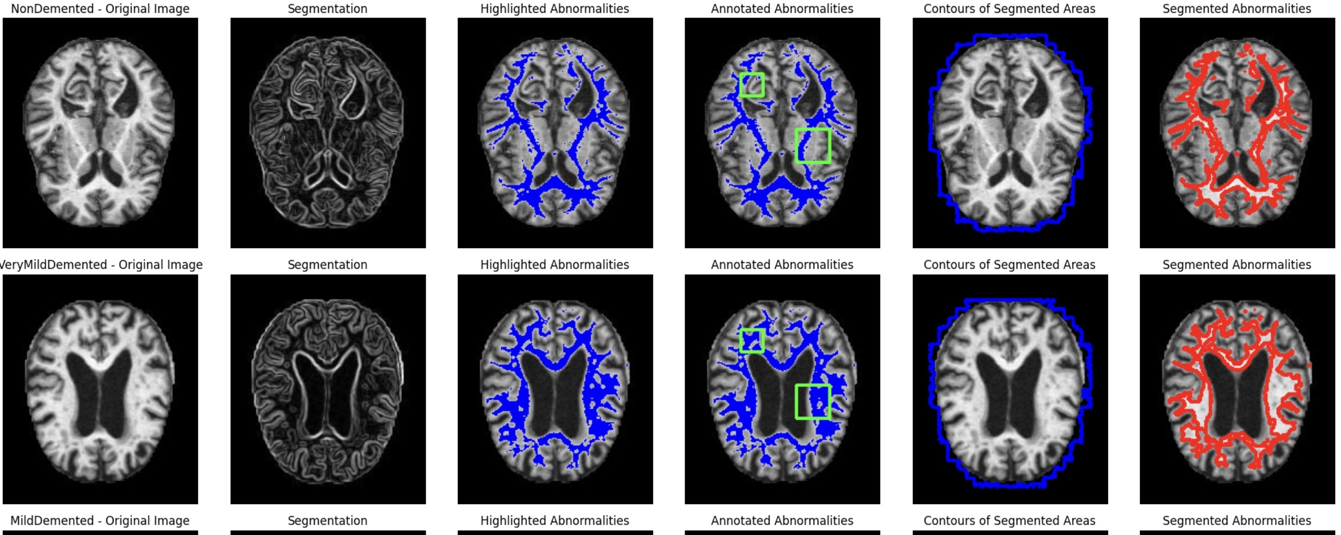
Alzheimer's Disease Detection and Prediction
.jpeg)
The image shows a collection of MRI brain scans labeled with different stages of dementia: "VeryMildDemented," "NonDemented," and "MildDemented." These scans are typically used to observe the structure of the brain and to detect changes associated with cognitive decline or dementia. The scans labeled "NonDemented" show a normal brain structure with clear, defined shapes of the brain's ventricles and surrounding tissue, indicating no visible signs of dementia-related damage. The "VeryMildDemented" and "MildDemented" scans may display slight differences in the ventricle size or other subtle changes, which could be indicative of the early stages of dementia.
Medical Image Segmentation with Dice Coefficient Analysis
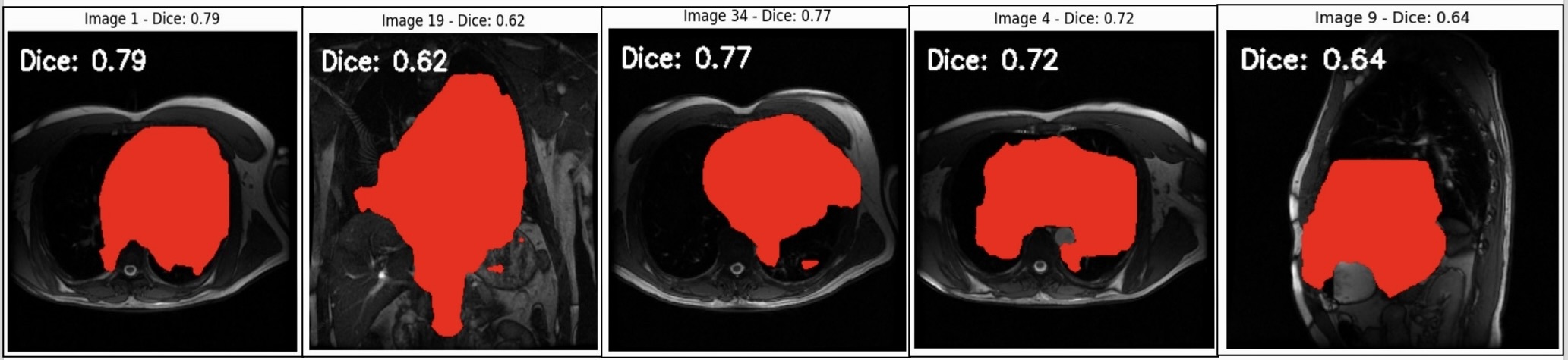
A medical image segmentation technique using deep learning models (e.g., U-Net or Mask R-CNN) to predict red masks on MRI scans. The Dice Coefficient, defined as \text{Dice} = \frac{2|A \cap B|}{|A| + |B|}, measures the overlap accuracy between predicted and ground truth masks, with scores ranging from 0.62 to 0.79